


Pink Cotton Fabric for Quilting: A Practical Buyer's Guide
You're standing in a fabric shop with your hand between two pink bolts, perhaps a chalky Ballet Slipper and a saturated Camellia. They're both labeled “rose,” yet one feels soft and fluid while the other feels crisp and slightly papery. You're wondering whether the difference will disappear after washing, whether the color will bleed into cream, and whether the fabric will still hold an accurate seam after cutting.
Those differences aren't just visual. Handfeel, GSM, weave, dye chemistry, and finishing determine how pink cotton fabric behaves under a rotary cutter, sewing machine, longarm, and washing machine. A soft bolt can tighten after washing, a vivid dye can release excess color, and a loose weave can distort during piecing.
This guide treats pink as a technical material choice, not merely a trend color. You'll learn how to read the fabric, compare useful brands, test a swatch, match shade and weight to a project, and buy with fewer surprises.
Standing in Front of the Wall of Pinks
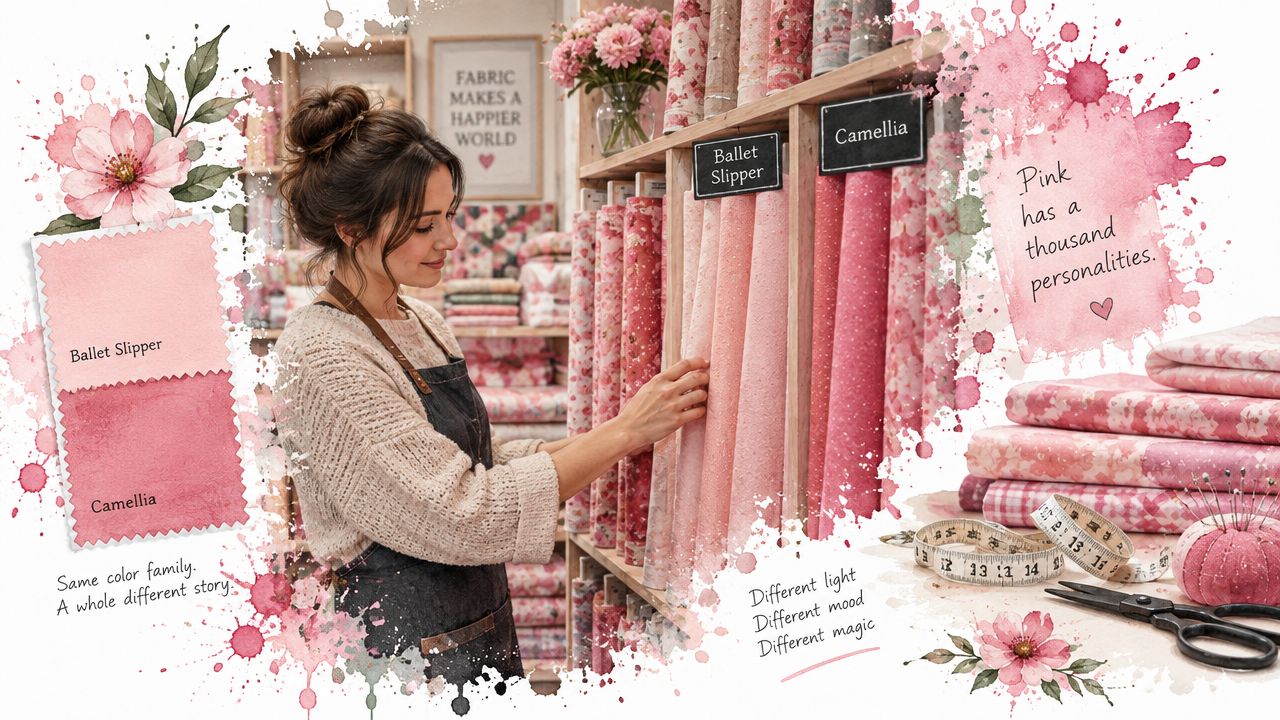
A pink fabric wall can be deceptively difficult to shop. The bolts look related under store lighting, but a blush solid may lean gray, a coral may turn warmer beside cream, and a magenta print may appear darker once it sits next to batting. I've learned to pull several bolts down and compare them at the same angle, because folded fabric hides both weave and surface finish.
The first question isn't “Which pink do I like?” It's “What does this pink need to do?” A baby quilt needs a fabric that tolerates repeated laundering. A pixel quilt needs stable edges and predictable value. A table runner may benefit from a firmer hand, while a wideback needs enough width and consistent coloration to avoid a distracting seam.
Why the bolt feels different
Two fabrics can share the same fiber label and still handle differently. Cotton fabrics relax during wet processing, and preparation, dyeing, and finishing can stretch length, reduce width, or leave residual tension that changes the finished dimensions. Cotton fabric guidance explains that construction and wet-processing stress both influence shrinkage.
Dye chemistry also matters. Historical textile records show that cotton was used in South Asia by about 3000 BC, and madder-dyed cotton textiles from roughly 5,000 years ago are associated with the Indus civilisation. Mordant preparation was necessary for red-family dyes to bind to cotton, making shades from pale pink through deep purple possible. Historical textile documentation also describes how synthetic dyes expanded the pink palette in the mid-1800s.
Shop-floor rule: If a pink looks perfect but the fabric feels unusually stiff, don't judge it before a wash test. The finish may be masking the final hand.
The useful lens is practical: inspect the weave, estimate the weight, rub the surface, check the dye, and decide whether the finished fabric will support your project. The fiber and weave give you the first clues.
Fiber, Weave, and Weight Basics for Cotton
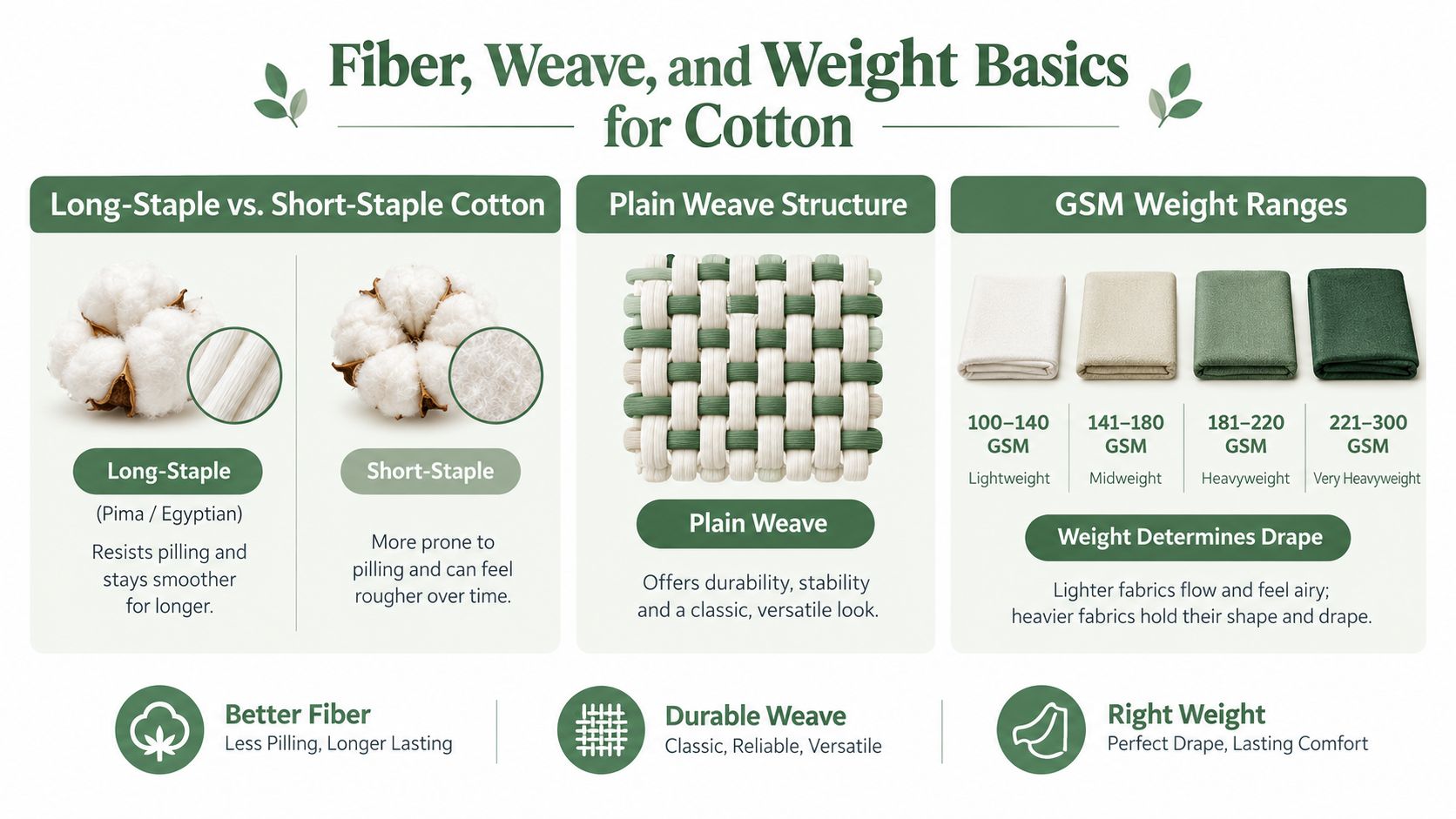
A quilting cotton specification tells you more than the color name. Start with fiber length, then examine the weave, and finally check the fabric weight. These three details affect pilling, fraying, drape, cutting accuracy, and how the cloth responds to quilting stitches.
Fiber length changes the sewing experience
Long-staple cotton, including Pima and Egyptian cotton, uses longer fibers that can create a smoother, more uniform yarn. That generally means fewer loose fiber ends, less lint, and better resistance to pilling than short-staple cotton. The difference is easy to feel when pressing seams or running fabric through a machine. A smoother cloth tends to produce a cleaner fold and a more settled surface.
Short-staple cotton isn't automatically unsuitable. It may be perfectly serviceable for practice pieces, backing, or a project where a slightly nubby hand is acceptable. The problem comes when a label implies durability without identifying the construction or finished behavior.
Plain weave keeps blocks predictable
Most quilting cotton uses a plain weave, with warp and weft threads crossing in a simple over-under structure. Quilting references commonly describe suitable quilting fabric around 60 to 75 threads per inch, while quilting cotton is also often described as 68 x 68 threads per square inch or higher. Thread-count guidance for quilting fabric notes that lower-count cloth is more likely to ravel, shrink, and expose batting through the weave.
Thread count isn't a complete quality score. A high count can still feel unpleasant if the finish is harsh, and a moderate count can sew beautifully when the yarn and finishing are consistent. For beginners, hold the fabric to the light and tug gently on the grain. Excessive openness or visible shifting suggests more risk during cutting.
GSM describes weight, not quality
GSM means grams per square meter, a useful way to compare weight across widths. A common quilting cotton benchmark is around 140 to 190 GSM, which gives pieced blocks enough body without the stretch and distortion associated with lighter apparel cottons. Quilting cotton weight guidance places this medium-weight range in the practical zone for accurate piecing.
A lighter cloth may drape beautifully but require more care. A heavier cloth can support structure but make bulky seams and dense quilting feel less forgiving. Pink dyes, especially strong magentas and fuchsias, may also need chemical preparation that leaves the bolt firmer before washing.
For a broader comparison of fabric types, use this guide to quilting fabric categories. Then treat the specification as a starting point, not a substitute for touching and washing a sample.
Popular Pink Cotton Brands Worth Knowing
Brand names help narrow a search, but they don't remove the need to test. I've handled bolts from Kona Cotton by Robert Kaufman, Ruby Star Society, Marcus Fabrics, and P&B Textiles, and each line has a recognizable balance of hand, surface, color, and construction.
Kona is my first stop when a pattern depends on solids. Its pink range includes familiar shades such as Carnation and Bubblegum, and the plain construction makes value comparison straightforward. It's especially useful for pixel quilts, where a small shift in value can change the shape of an image.
Ruby Star Society has a lighter, more fashion-led hand, with modern prints and lines such as Soft Pink and Cactus floral collections. The prints can bring more visual movement than a solid, but I'd preshrink before cutting because a looser-feeling weave can respond more noticeably to washing.
Marcus Fabrics suits traditional palettes and tone-on-tone pinks. The fabric feels denser in the hand, which can help when you want a heritage or reproduction look that remains visually steady after laundering. P&B Textiles is a practical stash-building choice. Some bolts feel stiffer off the bolt, but the hand typically softens after washing, making the line useful for basics and everyday projects.
A practical comparison
| Brand | Weave / Thread Count | Handfeel | Best For |
|---|---|---|---|
| Kona Cotton by Robert Kaufman | Plain quilting construction, commonly associated with a 60 x 60 weave | Smoothens after preshrinking | Solid-heavy quilts and pixel designs |
| Ruby Star Society | Lighter-feeling, sometimes looser-feeling construction | Soft, modern, print-friendly | Contemporary quilts and expressive focal fabrics |
| Marcus Fabrics | Denser-feeling quilting construction | Firm and settled | Traditional, reproduction, and tone-on-tone work |
| P&B Textiles | Dependable quilting basics | Slightly stiff off the bolt, softer after washing | Stash building and supporting prints |
The choice should follow the project, not brand loyalty. For solids-heavy work, Kona gives you a consistent visual language. For a modern quilt with one statement print, Ruby Star Society can supply the energy, while Marcus and P&B can anchor the surrounding values.
Before adding anything to your cart, compare your options with this quilter's guide to established fabric brands. A brand is useful shorthand, but the individual colorway and finish still deserve inspection.
Preshrinking, Colorfastness, and Care
Pink cotton fabric can fail in two ways that have nothing to do with your sewing skill. It can change size enough to disturb block dimensions, or it can release dye into neighboring light fabrics. I treat every saturated pink as untested until a scrap proves otherwise.
Wash the way the quilt will live
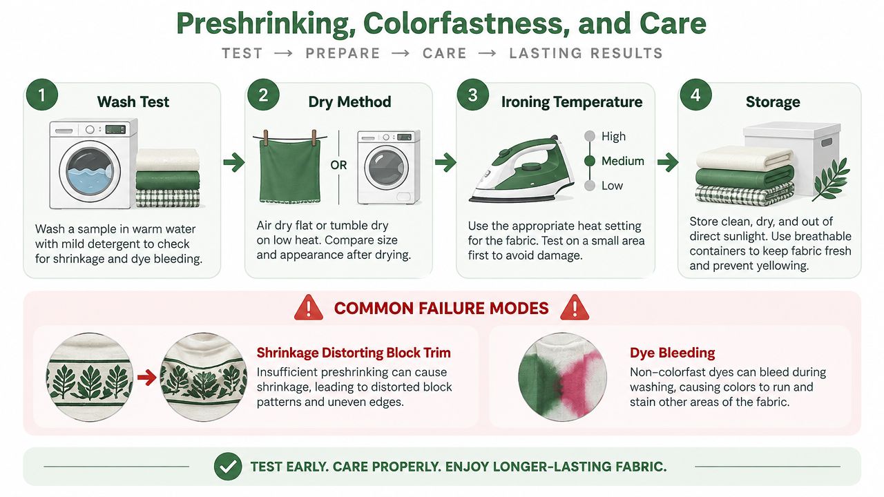
For a normal preparation wash, use 30°C water, a suitable detergent, and either Synthrapol or color-catcher sheets. Skip fabric softener, especially when the cloth has a waxy or heavily finished surface. Softener can coat fibers and make later absorbency, pressing, or quilting behave differently.
Cotton can shrink in both length and width. Fabric construction, tension relaxation, and wet finishing all contribute, so a bolt described as preshrunk still deserves a test. Even a 5% preshrunk claim doesn't guarantee that a 12.5-inch square will remain exactly the same after a warm tumble. A shift of 3 to 5 mm can matter when several pieced units meet at one point. CottonWorks technical guidance also connects dimensional performance to processing conditions and careful finishing.
Practical rule: Wash a representative swatch, not just a corner. Include the darkest pink and the palest fabric that will sit beside it.
Test for bleeding before cutting
Cut a small pink sample and place it against a white fat quarter in a glass bowl. Wet both with cool water, press them together, and leave them for a short observation period before checking the white cloth for tint. A visible transfer doesn't automatically make the fabric unusable, but it does mean you should plan a more careful wash routine and avoid assuming that color-catcher sheets solve every problem.
Reactive dyes are valued because they form covalent bonds with cellulose under alkaline conditions, which supports strong washfastness. The fabric still needs thorough wash-off, because unfixed or hydrolyzed dye can migrate and reduce color retention. Saturated pinks deserve extra attention because color loss and transfer are easier to notice on adjacent light cloth.
Dry and store with restraint
Hot water can set creases, while medium-heat drying can place unnecessary stress on seams once the quilt is assembled. Line drying preserves the hand more gently, though a low-tension drying method that allows the cloth to relax is preferable to stretching it across a line.
Iron with enough heat to remove wrinkles, but don't scorch the surface or press a damp, unstable fabric aggressively out of shape. Once dry, stack deep pinks separately from pale prints, especially if the storage area is warm or humid. Keep folded fabrics away from unwashed whites to reduce the chance of dye transfer during storage.
Use these fabric care instructions for quilting cotton as a reference point, then follow the specific fiber and finish information supplied with your bolt.
Matching Pink Shades to the Right Project
The right pink depends on value, weight, scale, and laundering, not just the name on the selvage. Before cutting, place the fabric beside the pattern pieces and the neighboring colors. A blush may disappear beside cream but stand out sharply beside white, and a saturated magenta can dominate a small block even when it looks balanced on the bolt.
Start with the project's job
A paper-pieced pixel quilt benefits from a low-volume blush on a light fabric with a stable surface. When seams must disappear, excessive contrast and a loose weave create more trouble than a slightly muted shade. A saturated magenta on medium-weight quilting cotton can suit a baby quilt when the fabric has passed a bleed test and the finished quilt will be washed carefully.
Dusty mill-rose tones work naturally with wood, linen, and neutral table settings. Bright fuchsia can make a strong wideback, but the front should have enough scale or negative space to keep the backing from competing visually at the edges.
A coordinated same-shade bundle can outperform a scrappy stash when the design depends on a controlled value progression. If the pattern uses repeated blocks, matching pinks across several prints also reduces the chance that one unexpected warm or cool undertone will interrupt the rhythm.
Use the specification as a filter
The table below gives a starting framework. Yardage depends on the finished dimensions, pattern, seam allowances, and whether the design uses precuts, so confirm the pattern requirements before ordering.
| Project | Shade Family | Fabric Weight (GSM) | Recommended Yardage |
|---|---|---|---|
| Pixel quilt | Blush or low-volume pink | Around 150 | Follow the pattern, then add cutting allowance |
| Baby quilt | Saturated pink or balanced magenta | Around 145 | Follow the pattern and reserve a test swatch |
| Table runner | Dusty mill-rose or muted pink | Around 150 | Order the pattern yardage plus binding allowance |
| Wideback backing | Bright fuchsia or large-scale pink | Wideback format | Order according to quilt dimensions and quilting layout |
A useful proportion check is to photograph the fabrics in grayscale. If two pinks become indistinguishable, they may merge in the finished quilt. For layout decisions, this guide to scale and proportion can help you judge whether a print or solid will support the pattern rather than crowd it.
Smart Sourcing and Buying Strategies
Open-stock shopping gives you freedom, but it can also turn a simple pink pull into a long search through near-matches. Curated fabric kits reduce three common headaches: color-match fatigue, project paralysis, and the difficulty of meeting shipping minimums without buying fabric you don't need.
A thoughtfully assembled fat-quarter set can give you six to eight prints balanced by value and tone, while hunting equivalents individually can consume 30 or more minutes and create three separate shipping fees. Those figures are part of the buying scenario, not a promise of savings, so compare the total cost and fabric quantity before deciding.
When a bundle earns its place
A curated bundle makes sense when the pattern calls for coordinated prints, when you're gifting a kit to a beginner, or when you want to start sewing without building a color system from scratch. It also helps time-crunched makers who'd rather spend an evening cutting and piecing than comparing nearly identical blushes.
Break out of the bundle for the parts that need independent decisions:
- Backing: Choose a wideback when reducing seams matters more than matching every front print.
- Binding: Select a stable, high-contrast strip when you want the edge to frame the quilt.
- Focal print: Add one statement fabric if the kit needs a stronger center or a more personal accent.
Swatch services are worth using for uncertain shades such as dusty rose or true magenta. I also compare thread cards from Aurifil and Coats against the actual cloth, because a thread that looks pink on a screen can lean purple or coral beside the fabric.
Buy like a tester
Ask for fat eighths when you're building a narrow color pull, verify the bolt origin when consistency matters, and keep a pink-only swatch ring with notes about washing, bleeding, and final hand. Supporting a local quilt shop can be particularly useful when you need to compare difficult shades under different lighting.
For larger projects, consider whether a coordinated kit or a selected bolt gives you the better control. Cotton bolt buying guidance can help you think through quantity, continuity, and the risks of mixing colorways.
Your Pink Cotton Checklist and Next Steps
A good pink fabric purchase should leave you confident about the first wash, the first cut, and the finished quilt. Use this checklist before committing to a full quantity.
- Confirm the GSM range. For quilting cotton, look for a medium-weight specification around 140 to 190 GSM, using the weight guidance above to distinguish structured quilting cloth from lighter apparel or craft fabric. The fiber, weave, and weight discussion helps you judge drape before ordering.
- Inspect the weave. Look for a stable plain weave with minimal shifting, excessive openness, or fraying. Thread-count references can help, but your fingers and a gentle grain check remain useful.
- Perform a swatch-wash test. Wash pink beside white at 30°C, use a color catcher, avoid softener, and check both dimensions and dye transfer. The care section gives you the test sequence before your fabric reaches the cutting mat.
- Select a suitable brand. Choose Kona Cotton by Robert Kaufman for solids, Ruby Star Society for modern prints, Marcus Fabrics for traditional palettes, or P&B Textiles for practical basics. The brand comparison shows where each line tends to fit.
- Match shade to the project. Use quieter blushes for low-volume piecing, dusty mill-rose for home decor, saturated pink for a washable baby quilt after testing, and bold widebacks when the quilt front can support them. The project table keeps color and weight connected.
Before ordering, decide whether you need yardage, fat quarters, a coordinated bundle, or a 108-inch wideback. Wideback quilting fabrics are commonly sold in 108-inch widths and are typically 100% cotton, which can simplify backing large quilts and reduce seams. Wideback fabric information gives a useful example of that format.
If you'd rather skip the trial-and-error loop, sign up for Email Sign-up Savings and watch for preshrunk pink fabric kits and fat-quarter bundles. It's a practical way to catch coordinated color pulls while keeping your swatch ring and project plan close at hand.
QuiltKit.com offers ready-to-sew kits, modern solids, coordinated bundles, pink cotton options, and quilting supplies including batting and widebacks for the finishing stage. Visit quiltkit.com to choose a tested-looking pink palette, order the quantity your pattern requires, and get your next project from fabric wall to finished binding with fewer surprises.