


White on White Quilting Fabric Guide for Texture
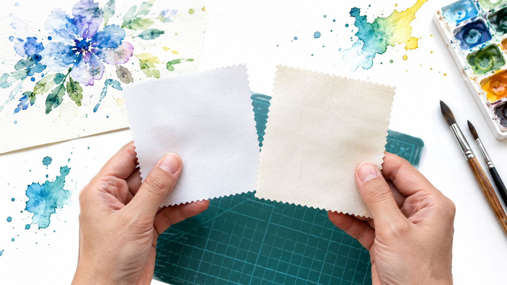
You're standing at your cutting mat with two bolts that both say white, and the white on white quilting fabric in your left hand suddenly looks icy while the piece in your right hand looks warm and creamy. Nothing changed except the light. That's the lesson that'll save your next quilt.
Why Matching Whites Are Never Quite Identical
I once held two swatches under bright shop lighting and couldn't tell them apart. At home beside a window, one looked cool and flat, the other showed a soft vine pattern and a warmer cast. We checked them again under a warm lamp that evening, and the difference grew stronger.
That shift isn't your imagination. Perceived whiteness depends on bleaching, fluorescent optical brighteners, fabric construction, and lighting conditions, and brighteners work by absorbing ultraviolet radiation and re-emitting part of it as blue light to counter cotton's natural yellow cast, as explained in research on fluorescent brightening agents in cotton. Two fabrics can match at noon and clash at dinner.
What you're really choosing
You're not choosing a color name. You're choosing weave tightness, print scale, thread density, drape, and how a seam behaves after pressing. A smooth solid gives you quiet negative space. A tonal print gives you shadow and movement when light rakes across it.
Busy makers don't have to start with yardage, either. Precuts, coordinated bundles, and modern solids can cut prep time while you learn to read these differences. Start by comparing swatches where the quilt will live, not just where you bought them. That single habit prevents most mismatched backgrounds.
What Is White on White Quilting Fabric
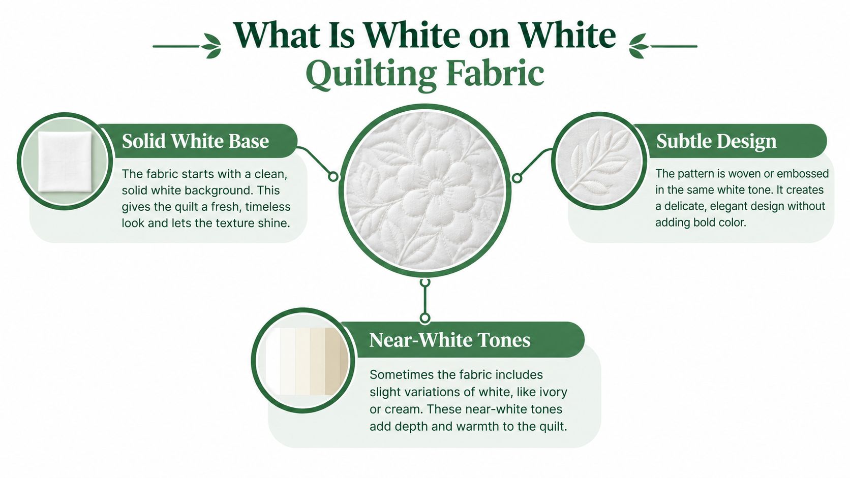
White on white quilting fabric is white or near-white quilting cotton whose design comes from a tonal print, woven texture, stitching, relief, or shadow rather than strong color contrast. Quilters use it for calm backgrounds, low-volume piecing, textured negative space, appliqué, and whole-cloth quilts where surface detail carries the design.
Think of a freshly painted wall. From across the room it's one flat color, but step closer and you'll see brush texture catching light near a window. White on white fabric works the same way, with flat tone as the base and modeled surface as the decoration.
Where the idea comes from
Museums define whitework as a whole-cloth quilt on bleached white fabric, with decoration created entirely through stitching, raised work, stuffing, or cords rather than colored pigment, a tradition documented in the Metropolitan Museum of Art whitework quilt record. The style originated in 17th-century France and 18th-century England before becoming popular in the United States during the late 18th and first half of the 19th centuries. Some American examples were made for a bride's wedding outfit.
Unlike patchwork, which depends on contrasting pieces, whitework depends on texture, shadow, relief, thread density, and quilting motifs. That history matters at your sewing table because it explains why the cloth itself had to be smooth and tightly woven. Detailed stitching and raised designs need a stable surface.
The modern version of the same principle
Today you'll apply that principle with piecing, appliqué, minimalist blocks, and all-over quilting instead of only whole-cloth work. The fabric might carry a printed white motif, a woven texture, or no visible motif at all until quilting stitches add relief. Trapunto and stuffed motifs still belong to this family, too.
Here's the distinction beginners miss. Intentional low contrast means you planned for pieces to sit close in value and separate through texture. Accidental mismatch means two whites fight because one is brightened, one is natural, and you didn't notice until the blocks were sewn. The word white on a bolt label can't tell you which one you're getting.
Compare Solids Tonal Prints Textures and Precuts
Start with the job, not the bolt. A background that must disappear behind bold piecing needs different handling than a background that's supposed to shimmer on its own. If you're still sorting categories, this overview of types of quilting fabric helps you place whites alongside other quilting cottons before you buy.
Plain solids read as the quietest option. They're forgiving when you rotate pieces, because there's no motif direction to match, and seams show mainly through shadow. Kona Cotton solids and lines associated with Ruby Star Society give modern makers familiar starting points, though you should still compare each white in person.
Tone-on-tone prints add a second layer. A small motif can vanish at normal viewing distance and read as gentle texture, while a larger repeat can become the feature of the quilt. Check print scale against your block size before you commit, because a motif that looks delicate on the bolt may get chopped into confusing fragments in small pieces.
White Fabric Format Comparison
| Fabric Format | Visual Character | Preparation and Handling | Best-Fit Uses |
|---|---|---|---|
| Plain solid | Flattest, quietest surface | Easy rotary cutting, no motif direction | Negative space, modern backgrounds |
| Tonal print | Pattern appears and fades with light | Watch motif direction and scale | Low-volume piecing, scrappy backgrounds |
| Textured white | Shadow and relief do the work | Press carefully to protect surface | Whole-cloth quilts, heirloom blocks |
| Precuts and bundles | Coordinated mix chosen for you | Less cutting, faster layout | Table runners, beginner quilts, gifts |
Textured or dimensional whites sit closer to historic whitework. Their interest lives in the surface, so quilting lines and raking light matter more than pieced contrast. They're beautiful for whole-cloth work, but they're less forgiving if you press hard or pair them with a busy print that steals the shadow effect.
Precuts and coordinated bundles trade control for speed. You skip much of the cutting table work and get fabrics already grouped to play well together, which suits fat quarters projects and quick runners. The trade-off is that you can't always replace one white with the same production lot later.
Don't treat thread count as a universal quality score. It's one clue about construction alongside hand feel, fraying, seam behavior, and laundering response. A fabric can feel dense and still press poorly for your project, or feel softer and piece beautifully. The table narrows your format. A swatch test settles the specific bolt.
Select Fabric With a Hands-On Swatch Test
Google added experience as the first E in E-E-A-T in December 2022, and its guidance points to actual use of a product as a way to show what you know, as described in Google's introduction of experience in E-E-A-T. For fabric, that means your hands and your iron tell you more than a product photo. I cut swatches, sew them, press them, and wash them before I trust a white with a whole background.
Typical quilting cotton thread densities run around 60 to 68 threads per inch, and pre-wash shrinkage commonly sits near 3 to 5 percent, with warp and weft sometimes shrinking differently, according to independent quilting fabric testing on thread density and shrinkage. That difference can distort blocks and ripple seams when fabrics shrink at different rates. You can read more context on construction in this guide to the best quilting fabric brands, then verify with your own sample.
Run the test in this order
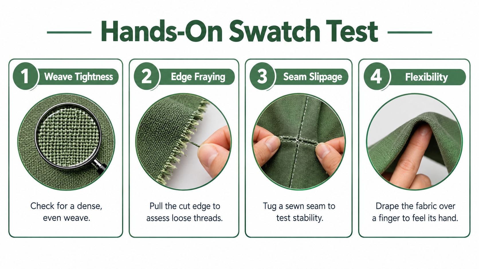
- Compare in three lights: Hold at least two swatches in daylight, warm indoor light, and ultraviolet-rich light, and note which one shifts.
- Mark and sew: Draw your intended seam allowance, sew sample seams, and tug gently to check for seam slippage or gaping.
- Cut and handle: Rotary cut a strip, fold it on the bias, and watch whether edges fray quickly or the fabric feels too stiff to manipulate.
- Press a sample: Press seams open and to one side, then check for distortion, shine, or loss of printed texture.
- Launder and measure: Wash a retained swatch, dry and press it, then measure length and width against your pre-wash numbers.
We tested finished half-square triangles this way and the lesson was simple. A fabric that frays at the cutting mat will keep fraying at every nesting seam, no matter how pretty its motif looks. Lower-density fabric can also permit seam slippage, while very dense fabric may resist folding and bias handling.
Practical rule: Buy from one production lot when a uniform background matters, and never assume a nominal width survives laundering unchanged.
Test fusibles and spray basting on scraps, too, especially for appliqué. If a white will sit next to a Hobbs or Pellon batting and a wideback with different shrinkage, wash all components the same way or deliberately wash none of them. Consistency protects your finished dimensions. When you're ready to order, compare solids, tonal prints, and precuts side by side and order enough yardage from the start.
Build Low Contrast Without Losing Definition
Two whites that merge beautifully under flat ceiling light can separate sharply when sunlight rakes across the quilt from a side window. That isn't a flaw to fear. It's a design lever you can control with texture, scale, and quilting lines, and this primer on scale and proportion in quilts gives you language for judging those relationships.
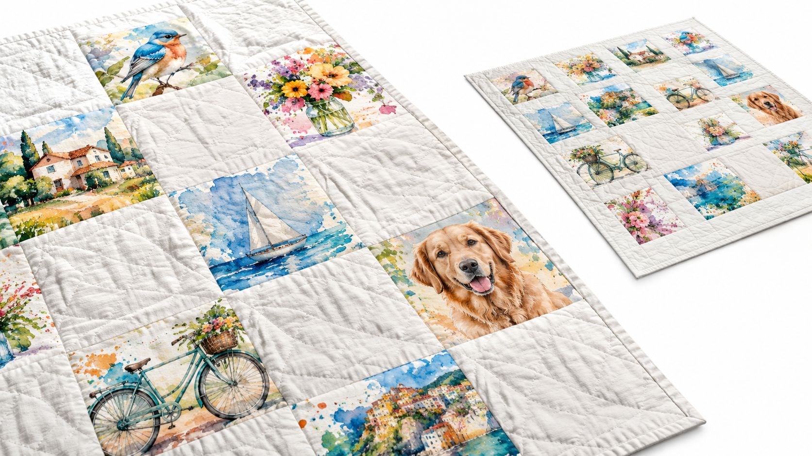
Look at how pieced shapes hold together when texture, not color, separates one area from the next.
Vary one thing at a time
Pair a plain background with one tonal print before you add a third white. If the design still feels flat, change the quilting motif density or add appliqué shapes with a slightly different surface. Adding more near-identical whites usually creates confusion, not richness.
- Pattern scale: Small motifs texture a background, large motifs claim attention.
- Motif density: Sparse prints breathe, dense prints can compete with quilting stitches.
- Seam lines: Pressing direction creates tiny shadows that outline shapes for free.
- Accent control: One controlled color can anchor a white palette without breaking its calm.
Watch how an experienced maker handles low-volume backgrounds in pieced blocks before you cut your own.
The calm, dimensional, or indistinct test
Pin sample blocks on a wall and step back. Calm means shapes read clearly but unobtrusively. Dimensional means light reveals layers as you move. Indistinct means you can't find the block edges at all, and that's your signal to increase texture contrast or widen the value gap.
Low contrast is intentional visual quietness. It is not an excuse for mismatched materials.
Advanced makers can push definition further with precise piecing and controlled batting loft, since raised areas sharpen stitch definition under directional light. Keep your tension even so quilting lines stay crisp rather than sinking unevenly. Judge the sandwich as a whole, because top, batting, and backing together decide how much shadow your whites can cast.
Use White Fabrics in Modern and Traditional Quilts
A modern pixel-style quilt gives white on white fabric a structural job. The background squares hold the grid steady while colored pixels form the image, and a faint tonal print keeps large empty areas from looking blank. If that style appeals to you, these modern quilt patterns show how negative space carries a design.
Beginners can simplify that idea with bigger squares and fewer colors. The white still does the quiet work, but you spend your energy on accurate seams instead of tiny pieces. I placed two finished blocks beside a window once and watched a subtle print disappear completely, which taught me to check pixel backgrounds at viewing distance, not at arm's length.
Traditional routes that still work
A traditional all-over floral quilt flips the relationship. Colored motifs repeat across the top, and white sashing or alternate blocks give your eyes resting places between them. Here motif scale in the print fabric matters most, and the white needs only enough texture to avoid looking flat beside busy florals.
A whole-cloth piece sits at the other extreme. Dense quilting, stuffed motifs, and corded lines create every bit of the design, continuing the whitework tradition in its purest modern form. Choose the smoothest, most stable white you tested, because every wobble in your stitching will show.
For a fast finish, build a table runner from coordinated precuts. The pieces arrive cut, the whites already harmonize, and you can focus on layout and quilting. That's a satisfying weekend project and a low-risk way to learn how tonal fabrics behave together.
Reading the white palette
Treat cream, icy, brightened, and warm white as four different colors that happen to share a name. Lay them together, label each scrap, and pick one family per project unless contrast is your goal. Collegiate gift quilts and tailgate throws benefit from that discipline too, because team colors look sharper against one consistent white. When you shop, compare solids, tonal options, and precuts together rather than ordering a white in isolation.
Care for White Quilts Without Damaging Texture
A pale quilt doesn't automatically need frequent washing. Preservation guidance reports that only 12 percent of quilts in an AQS 2023 survey were washed more than once every 15 years, while 63 percent of those washes reportedly caused unintended damage such as dye bleeding, batting clumping, or seam puckering, as summarized in preservation guidance on quilt washing frequency and damage. Prevention usually beats laundering, and these fabric care instructions outline the gentle end of your options.
Start by asking how the quilt lives. A decorative wall piece needs dust control and light management, while a bed quilt used nightly needs a realistic cleaning plan. Then weigh fabric age, batting type, quilting density, stain location, and fusible products before any water touches it.
A conservative sequence for an unknown quilt
- Identify materials: Check labels, seams, and any notes from the maker.
- Inspect first: Look for yellowing, weak seams, and adhesive areas under good light.
- Test hidden fabric: Try your mildest treatment on a seam allowance or hidden scrap.
- Treat and dry fully: Work on the smallest area possible and let it dry completely.
- Recheck the match: Compare the treated spot under the quilt's display lighting.
Never test a treatment on the displayed face of an heirloom quilt. If there's no hidden area to test, stop and get advice first.
Why whites yellow without dye bleeding
Most tested adhesive sprays caused significant yellowing or strength loss after light and heat aging in a university textile study of adhesive sprays on fabric. That matters when your quilt contains fusible appliqué or spray basting. Heat can also flatten raised white patterns, so press from the back with a protective cloth and check texture as you go.
Don't assume oxygen bleach or whitening products are safe for batting, thread, or printed motifs. Spot-treat food stains gently to avoid a halo, store quilts clean and away from direct light, and consider a removable cover for pieces that get daily use. Careful storage protects optical whiteness longer than repeated washing ever will.
Choose Your White Fabric and Keep Creating
Pick the simplest format that fits your time. Choose a solid for the fastest project and the cleanest background, a tone-on-tone print when you want pattern interest that appears in changing light, a textured white when shadow and quilting carry the design, or a precut when your preparation time is short.
Beginners should prioritize visible swatches, simple layouts, and enough yardage from one lot. Advanced makers should match stated construction and laundering behavior to the project, especially for heirloom or high-wear quilts. Guilds and teachers benefit from that same consistency when a whole group sews the same pattern.
Frequently asked questions
Can I mix two whites in one background? Yes, if you test them in your display lighting and the difference looks intentional. Otherwise buy one lot.
Should I prewash white on white fabric? Prewash all fabrics in the quilt, or none, so shrinkage stays consistent. Measure a test swatch either way.
Why did my white turn yellow with no dye bleed? Optical brighteners, adhesive residue, heat, and light exposure can all shift whiteness. Test fusibles on scraps first.
Compare quilting fabric solids, tonal prints, coordinated bundles, and precuts side by side, then plan your project around the swatch that passed your test. If you're not ready to buy today, join the email list for Email Sign-up Savings, project ideas, and future offers that help you build your stash with confidence.
Ready to put your swatch test to work on real yardage? You'll find white solids, tonal prints, coordinated bundles, precuts, batting, and ready-to-sew kits gathered in one place, so you can match your whites with confidence and start piecing sooner. Visit quiltkit.com to compare your options and choose the fabric your next quilt deserves.