


Black Tone on Tone Fabric: A Modern Quilter's Guide
You're standing at the cutting table with a black fabric that looked almost plain on the bolt. Up close, though, the surface reveals tiny dots, a quiet damask, or a geometric texture that catches the light. The question is whether that detail will enrich your quilt or turn into an unexpected pattern once the fabric is cut, pieced, quilted, and washed.
Black tone-on-tone fabric earns its place in a modern quilter's stash because it creates depth without introducing another color. The right piece can support a sharp pixel quilt, frame a bright accent, soften a minimalist grid, or give a table runner a more finished surface. The wrong scale, batting choice, or care routine can make the same fabric look flat, overly busy, gray, or uneven.
Understanding Black Tone on Tone Fabric
At the cutting table, a black fabric may look solid until you bring it close. Then a faint damask, dot, weave, or sheen appears. That shift matters because quilting changes the viewing distance. A motif that seems quiet on the bolt can become a visible design element after cutting, piecing, quilting, and washing.
Black tone-on-tone fabric keeps its ground and pattern within one color family. Black may sit against charcoal-black, or a matte surface may meet a slightly lustrous motif. From across the room, the cloth can read as a solid. At sewing distance, it supplies texture without introducing another color or competing with neighboring fabrics.
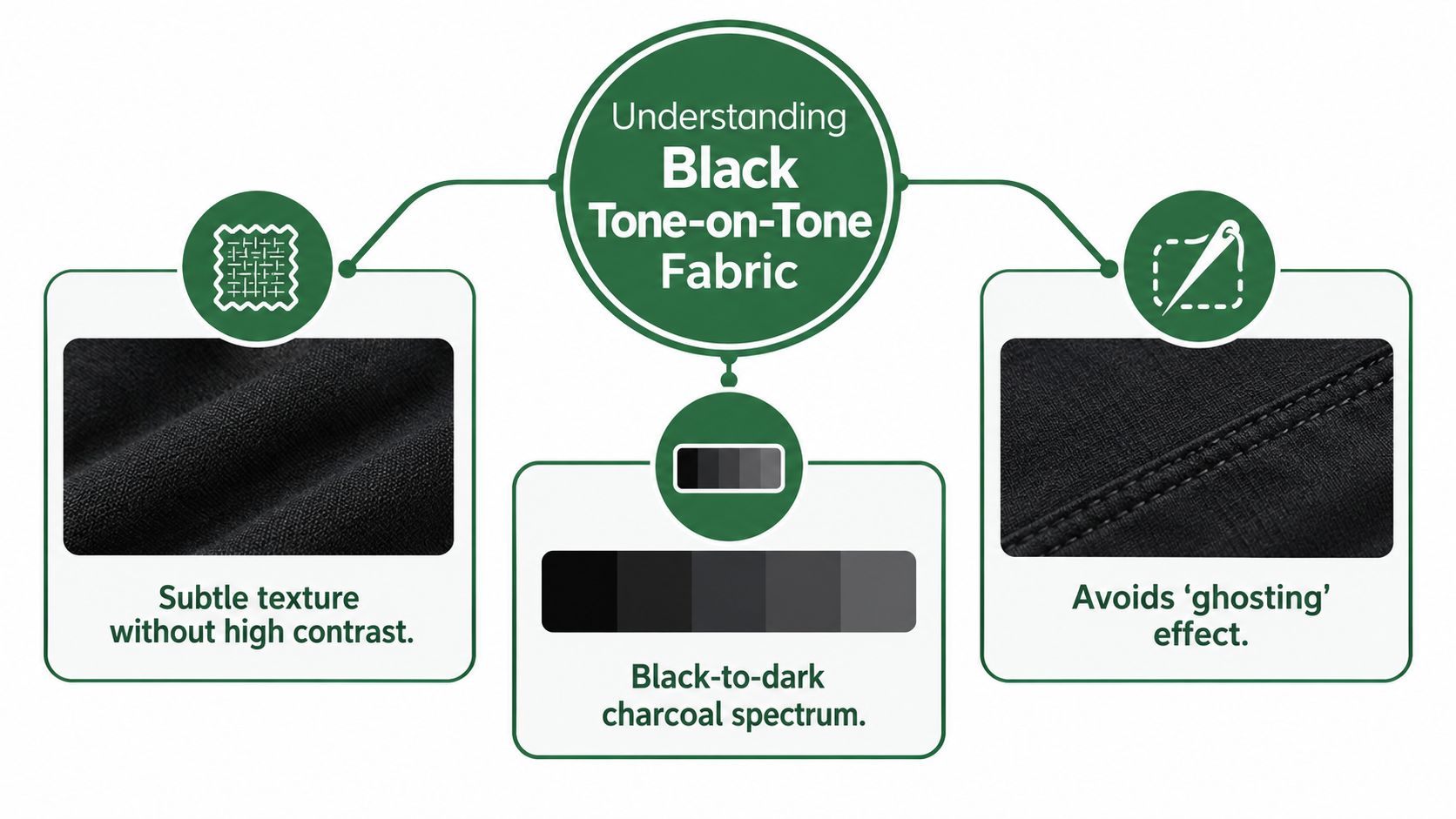
Why the narrow value range matters
Modern quilt geometry usually depends on clear contrast. A dark tonal background can support that structure while keeping broad areas from looking empty. As light shifts across the quilt, one patch may appear nearly solid, then reveal its motif as the quilt moves or the stitch direction changes.
I test this behavior before committing fabric to grids or half-square triangles. A tight weave and restrained motif usually keep seam lines readable. Glossy surfaces, raised textures, or oversized designs can draw the eye away from alignment. Black batting can intensify the effect by absorbing light and making a subtle print appear quieter, so test the fabric with the intended batting rather than judging the bolt alone.
Practical rule: If the fabric looks dramatic before cutting, sew and quilt a test block first. Check it from arm's length, across the room, and after laundering.
A short history behind dependable black textiles
Deep, durable black was difficult to produce before synthetic dyes. Makers often dyed cloth repeatedly, combining blue dyes such as woad or indigo with iron-based mordants. Natural black could turn gray, brown, or bluish, while logwood from Mexico and Central America became an important source of fast black when used with ferrous sulfate. The history of black dye development provides useful context for the repeatable black grounds and tonal motifs available to quilters.
William Henry Perkin's discovery of mauveine from coal tar in 1856 helped start commercial synthetic dye production; direct cotton dyes, including azo dyes, entered commercial use in the 1880s, and by 1914 thousands of synthetic dyes were on the market. That consistency is why today's black tonal prints hold their ground and motif relationship wash after wash.
The Impact of Scale on Visual Perception
A black tone-on-tone fabric can look almost solid on the bolt, then reveal a strong pattern after cutting. Motif scale determines whether the cloth supplies quiet texture or becomes a design element inside the block. A small print may blend into the ground, while a larger one can create secondary shapes across repeated units.
The effect resembles a television screen viewed from across a room. Individual pixels merge into one image at a distance, then become visible as you move closer. On a quilt, a tonal motif can appear restrained in yardage but become prominent in a small patch, especially when several units repeat it.
Matching scale to the cut
Small-scale prints suit intricate piecing because they add surface interest without competing with the block's main shapes. Use them for narrow sashing, small squares, background fields, and foundation paper piecing, where the fabric will be divided into many sections.
Large motifs need deliberate placement. They can look effective across a broad border or whole-cloth panel, yet become awkward in a small half-square triangle. Cutting may place the design in one corner, turn it into an unintended stripe, or create a secondary shape that was absent from the original layout.
Before committing yardage, test the fabric at three viewing distances:
- At close range: Examine the motif, sheen, raised texture, and direction. These details often disappear once the fabric is cut into small units.
- At approximately 1–2 meters: Decide whether the cloth reads as a calm dark field or a noticeable print. This distance-based evaluation is recommended for tone-on-tone fabric selection.
- At the finished cut size: Place the fabric over a paper template, or cut a test patch. A 2.5-inch square may make a subtle motif dominant, while another print may lose all visible pattern. I check the sample at arm's length and across the room before cutting a full set of units.
Scale and proportion also affect how neighboring blocks relate, particularly when black fabrics shift from texture to graphic pattern. This guide to scale and proportion in quilt design offers a useful reference. Choose the print for the finished unit, not only for the uncut yardage.
Pairing Black Tone on Tone with Black Batting
Black batting changes the entire value structure of a dark quilt. With a black ground fabric and black batting, the quilt tends to retain a continuous, deep appearance. Quilting lines can blend into the background, creating a subdued “ghosting” effect where texture is felt and seen through shadows rather than highlighted by contrast.
White or gray batting produces a different result. It can make quilting stitches and raised areas more visible, especially where the fabric is thin or the quilting is closely spaced. That added definition may be desirable for an elaborate longarm design, but the quilt can lose some of its nearly monochromatic darkness at the surface and edges.
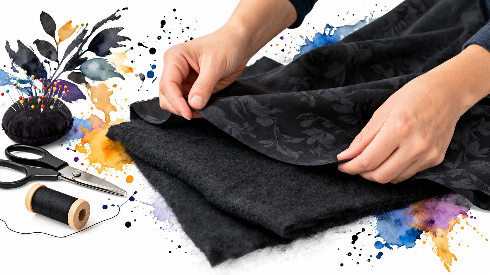
Choosing the batting by the intended effect
For a modern, architectural quilt, black batting usually supports the fabric's quiet value shifts. It's especially effective when you want the piecing and texture to read as one dark surface rather than as a high-contrast quilting illustration.
For stitch definition, white or gray batting may be the better choice. The lighter interior can emphasize quilting texture and loft, but test it first because the visual change depends on fabric density, quilting spacing, and light.
| Desired result | Batting direction | What to expect |
|---|---|---|
| Continuous black surface | Black batting | Subtle stitch definition and a strong ghosting effect |
| More visible quilting | White or gray batting | Stronger texture and greater value variation |
| Balanced darkness with moderate definition | Test both on a quilt sandwich | The final result depends on weave, loft, thread, and stitch density |
Test the sandwich, not just the fabric
Make a small quilt sandwich using the actual tone-on-tone fabric, thread, and batting. Run a few straight lines, curves, and dense motifs if your longarm design includes them. Press the sample and view it under the lighting where the finished quilt will live.
I've found that a fabric with a soft matte face can reveal quilting through shadow even with black batting, while a smoother surface may need more stitch density to show dimension. If you're comparing black batting options, this guide to black batting for quilts provides useful context before you order or cut.
Testing for Colorfastness and Crocking
A black quilt can look perfect on the cutting table and still surprise you in the wash. Bleeding means dye moves into water and may stain neighboring fabrics. Crocking means dye transfers through rubbing, either when the fabric is dry or when it's damp.
Testing a swatch won't predict every condition, but it can reveal obvious problems before lighter fabrics are sewn permanently beside the black. Research on cotton textiles found lower fixation for black reactive dye than for the tested red and yellow dyes, with black at approximately 77% fixation, compared with 82% for red and 84% for yellow in that formulation. The study also reported strong retention after 10 laundry cycles, showing that initial fixation and real-world wash performance are related but not identical. Read the cotton dye-fixation research.
A practical home test
Use an unwashed swatch from the actual fabric. Don't substitute a similar-looking black from your stash, because dye behavior varies by formulation, weave, finish, and manufacturer.
- Dampen white cotton. Use a clean white cloth or scrap of unbleached-free white quilting cotton.
- Rub the test area. Apply firm, even pressure over the black surface while the white cloth is damp.
- Repeat while dry. A dry-rubbing test can reveal surface dye that doesn't show during wet testing.
- Inspect both materials. Separate dye transfer from ordinary lint. Dye creates a colored mark that follows the rubbing area, while loose fibers may appear as fuzzy debris.
- Wash a second swatch. Use the detergent and temperature you intend to use for the finished quilt, then repeat the rubbing test after drying.
Testing note: Pressing damp black fabric against white cotton is a quick warning system, not a laboratory colorfastness rating.
What to record before cutting
Write down the fabric content, weave, care label, detergent, water temperature, and whether the swatch was prewashed. If the black lightens unevenly, transfers heavily, or develops a different relationship between ground and motif, stop and reassess.
Prewashing can remove excess dye and reveal shrinkage or surface changes, but it won't make a fabric permanently immune to abrasion, detergent chemistry, or light. It's also wise to request or check information about colorfastness to laundering, crocking, and lightfastness when buying fabric for a frequently washed quilt.
Styling and Colorwork Advice for Modern Quilts
Black tone-on-tone fabric gives you control over contrast. Use it beside a true black solid when you want a monochromatic quilt with quiet shifts, or place it behind a saturated accent when you want the brighter fabric to carry the composition.
The most successful pairings usually separate roles. Let the solid establish a clean graphic shape, then use the tone-on-tone fabric for a background, border, or secondary unit. Ruby Star Society prints can add a lively modern accent, while Kona Cotton solids provide a dependable, flat field against which the tonal surface can register.
Build a restrained palette
A black-on-black quilt doesn't need multiple competing prints. Combine one tonal motif with a solid, a low-contrast gray, or a carefully chosen accent color. The tonal fabric can then create movement without forcing every block to announce itself.
For a bold modern layout, try:
- A black background: Use the tone-on-tone fabric in broad negative-space areas where the pattern can remain visible.
- A bright accent: Pair black with a saturated color for team spirit, gifting, or a collegiate-inspired palette.
- A controlled monochrome: Combine black solids, charcoal, and one black tonal print so value does the work.
- A framed motif: Place the tonal fabric in borders or binding, where close viewing rewards its surface detail.
Let the quilt decide the placement
A large-scale damask may be beautiful across a border but too distracting in a small star point. Tiny dots can disappear in a broad backing yet provide just enough texture in a narrow sashing strip.
I also consider the reverse side. A black tone-on-tone backing can make a simple quilt feel intentional, but a dense motif may compete with the front when the quilt is folded over furniture. Review this black and gold fabric styling guide for another example of how a dark ground can frame stronger accent colors without overwhelming them.
Care Instructions to Preserve Deep Black Hue
Black cotton needs thoughtful care because fading can come from more than washing. Visible light and ultraviolet exposure can weaken dyed textiles, while heat, moisture, alkaline conditions, oxidizing bleach, and abrasion can accelerate color change. The effect can be especially noticeable in black dye. Textile research on light, moisture, detergent, and dye degradation supports treating dark quilts as light-sensitive textiles rather than ordinary household linens.
Washing and drying choices
Wash a finished quilt only when needed, especially if it's displayed rather than used every day. For routine laundering:
- Use cool or cold water: Lower temperatures are gentler on dark dye and cotton fibers.
- Choose a mild detergent: Avoid chlorine bleach and oxygen bleach unless the care label specifically permits them.
- Reduce abrasion: A gentle cycle and a properly sized machine can help protect the surface.
- Dry thoughtfully: Keep the quilt away from direct sunlight and excessive heat.
- Stop while slightly damp: Reshape the quilt and finish drying it away from strong light if the care instructions allow.
Wet exposure to light can fade cotton reactive dyes faster than dry exposure, so don't leave a freshly washed black quilt in a sunny window. High-friction areas, including binding, folded edges, and frequently handled corners, may show surface change before the central field does.
Storage and display
Fold quilts loosely rather than compressing them tightly for long periods. Store them away from direct sunlight, heat sources, and damp conditions, and refold periodically so one crease doesn't bear all the wear.
For a detailed reference on washing, drying, and storing quilting cotton, use these fabric care instructions. Care labels still take priority, particularly when a project combines cotton with specialty finishes, metallic details, or non-cotton components.
Quick Project Suggestions for Advanced Makers
Black tone-on-tone fabric works especially well in projects where texture matters as much as color. A small project lets you test scale, batting, thread, and washing behavior without risking a full quilt top.
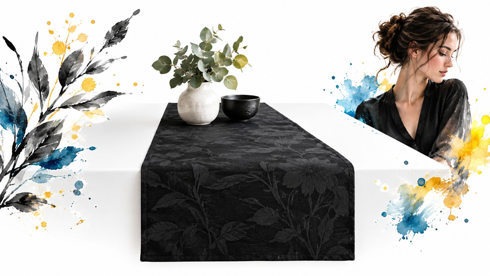
Three useful starting points
- Modern table runner: Use a narrow tonal motif for the main field, then add a black solid border. This is a practical test for fraying, pressing, binding wear, and how black batting changes the surface.
- Wall hanging: Choose a larger motif or a bold geometric layout. Because the piece won't face constant laundering, you can prioritize visual scale and stitch definition, but display it away from direct sun.
- Minimalist quilt: Build a grid from black solids, charcoal, and one tone-on-tone fabric. Keep the tonal print in selected blocks so the surface doesn't become visually uniform.
Precuts can reduce preparation time, especially for a table runner or a pixel design built from repeated units. A coordinated kit can also simplify the relationship between background, accent, backing, and pattern instructions, while experienced makers may prefer to substitute their own batting and thread.
For geometric projects, preview the cut size before buying a large quantity. These pixel quilt pattern ideas show why a fabric that reads as a solid can be valuable, but also why a tonal motif may need to be tested inside the smallest unit.
Conclusion and Next Steps for Your Quilting Journey
Choosing black tone-on-tone fabric is a design decision, but it's also a testing decision. Look at the motif from close range and approximately 1–2 meters away, then check how it behaves in the actual cut size. A small sample can reveal whether the print supports your geometry or creates secondary shapes you didn't plan.
Make a quilt sandwich before choosing black, white, or gray batting. Test damp and dry rubbing before placing the fabric beside pale cotton, and prewash a swatch with the detergent you'll use. These steps take little time compared with unpicking a stained quilt or discovering that a carefully chosen tonal contrast has faded unevenly.
First-hand observation still matters. Google's guidance describes Experience as evidence of direct involvement, such as using a product, and distinguishes that from generic expertise. It also clarifies that E-E-A-T helps quality raters assess search-result quality rather than functioning directly as a ranking factor. Google's guidance on Experience and E-E-A-T supports a practical standard for fabric writing and buying: describe what the cloth feels like, how it presses, whether it frays, and how its surface changes after testing.
For a dark modern quilt, the best fabric isn't just the blackest bolt. It's the one whose scale, weave, batting relationship, and care behavior support the finished project.
QuiltKit.com offers ready-to-sew kits, modern solids, coordinated bundles, black batting, wideback cottons, and quilting supplies for projects built around subtle contrast. Browse the curated selection at quiltkit.com, and join the Email Sign-up Savings list if you're still comparing fabrics before your next cut.